The purpose of this assignment was to create a small series of sketch books. Included in the blue pack are:
A sketchbook I work in
2 concertina sketchbooks
1 customised sketchbook
1 textile artist-inspired sketchbook
For the first concertina sketchbook, drawing from memory, I chose the A82 journey in the Highlands between Callendar and Loch Ness. I sketched it out first and took on board the idea of incorporating words as suggested b y my tutor. As I was working on it I began to think about practising embroidery, crewel work, tapestry. Should I practice stitching – can I recall any of it? I created the booklets first – was that a wise move – because after folds I then had to work around the creases! But it was fine.
The journey by memory was quite moving. I haven’t been up the A82 since moving away from the Highlands. My memory was fuzzy about the first half of the journey, the second half was much clearer. I recalled all the bridges, mountains, animals, lochs, landmarks en route. I worked in PITT pens, black ink with brushes, a nib, some charcoal. I thought this booklet might have been better in colour and the urban one in monochrome.
The journey – drawing from life, is an every week day walk I do to and from work, through my home town. I go past the river, canal, mills, the iconic clock tower. I added a running stitch and recipe. I enjoyed creating the the books, and the journey by memory more so. So much more could have been added and it would have probably worked nicely in threads and yarns, including the landscape, recipes, fond memories.
Then I customised a sketchbook after researching the mentioned artists. I explored Ben Nicholson . It was a difficult choice to make but I went with Heron instead. I found an old hard backed Moleskine with some writing in it from around ten years ago. Around a third of it was full. 
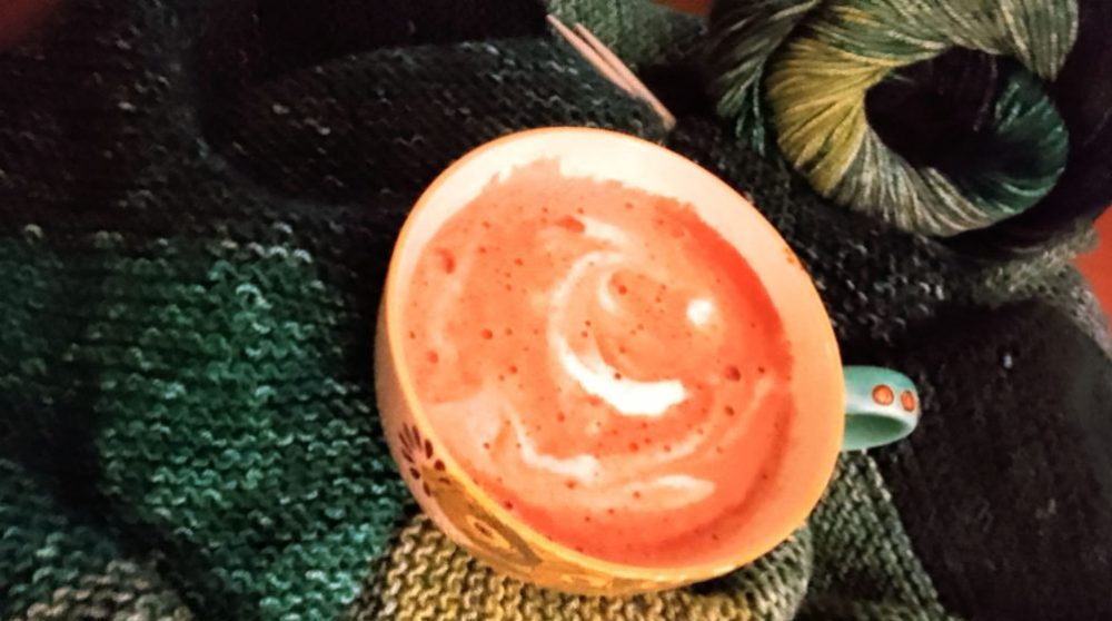
I liked Patrick Heron‘s work. His messy carefree style was more appealing as was his capacity for change over the years, plus the bold almost primal colours he worked with.  This was a fun exercise. I worked on the coffee pot, cups and shot glasses, sometimes exposing words or pieces of prose that meant something to me even now, after ten years.
Heron’s work is neither Rothko nor Matisse. He is more playful, fun, light with the use of colour and shape, not as precise as Matisse or spiritual like Rothko. Distinctly British. It felt like I was working on sugar paper with powder paint in primary school! I noted that he would sometimes put a dark layer under a lighter colour to give it more depth. He sometimes outlined objects in black or gave them a white space, with no colour touching them. The more I looked the more I observed. It was intriguing to note that he could be quite sloppy yet without doubt, it was art. The texture, shadow and light is there too, not obvious to begin with. I practised all of this over the pages.
It was more difficult than I thought it would be, to follow this type of seemingly free style. I noted that some colours took on a different glow at dusk and were more appealing than in broad daylight and made the image more interesting, less flat.
For the final exercise I researched all the recommended artists – Dorothy Caldwell, Caroline Broadhead, Eva Hesse, Suzumi Noda and decided upon Dorothy Caldwell’s work, style and ethic to help create the textiles sketchbook. She is a Canadian artist with 50 years’ experience in her field. She wo rks with cloth, dyeing, stitching in shibori and kantha styles. Her work really appealed and I think I may have found my guru. It was fascinating to read her biography and all the research and collaboration with organisations she had done, plus the exploration of Shibori in Japan which amongst other methods, informs her ongoing exploration of mapping, landmarks, geology, found objects. She isn’t a conventional textiles artist, but somehow encapsulates something primordial.
I began by doing some sketches of mountains previously drawn in the first exercise – journey by memory and considered how Caldwell imprinted a sense of place on her pieces. I dyed some calico with turmeric, red cabbage and onion skins – no mordants – I had done dyeing of yarn some years ago. Then I proceeded to stitch, paint and mark the pieces of dyed cloth as Caldwell might, thinking and feeling the Highland tundra landscape.
On pieces of paper I marked out the moors and mountains with ink, nib, brush, PITT pens, forming shapes and elements.
I used coloured threads to mark out the hues of heather, water, the orange sandstone. The strong yellow of turmeric on calico reminded me of the broom which grows alongside roads giving a heady scent of coco-butter.
It was a pleasant exercise which I built up over a period of time, returning to the ideas every so many days. I liked what came together and enjoyed the mark-making, stitching and dyeing, for a project and then to create an end-product.
When I look at what is in the blue bag, it seems as if not much time was spent on making! I did a lot research on the artists I chose, explored their work and reflected on what I could incorporate from what I had done and created so far. I did do a lot of work in preparing and making. The themes are the same as they always have been, in my writing – what is sense of place and does it matter as long as you have coffee and the ancients with you! It’s the journey that counts. Sometimes displacement takes us on that journey, but we must always be aware of the world around us through our senses, our feelings.It felt good to put it in to art.
Student no. 517195.